Wan4u
Our client is a wireless internet provider called Wan4U. The client wanted to make their website more appealing to the public as their old website contained mostly text and the mobile layout started to break in some areas.
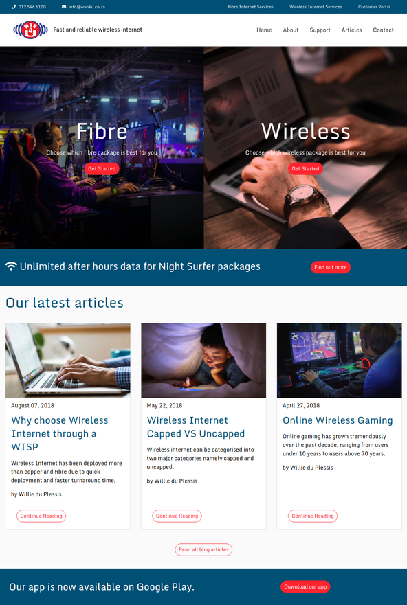
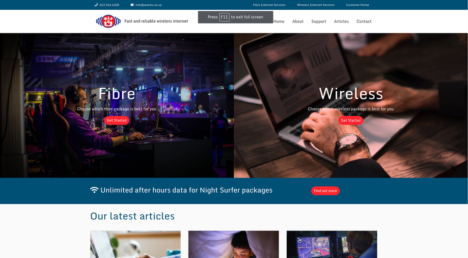
They focus on 2 main service categories, namely wireless internet and fibre internet, and they wanted a solution to showcase both of these on the frontpage. We decided to split the hero banner into 2 sections to highlight both of these services in a meaningful way and at the same time to look good.
On their old website, they had little to no user engagement. We decided to create a blog section to address this issue. The latest blog articles are shown on the front page and the rest of the articles are listed on the blog page.
We decided to use a static website because the client does not need a database or cms platform. Even though the website is static, we can still make changes and modifications according to the clients future requirements.
Mobile Layout
See the mobile version of the website in this video below.
View screenshots of the website here:

 (1).png)
 (2).png)
 (1).png)
.png)
.png)
.png)


.png)
.png)
.png)
.png)

 Cookie Notice
 Cookie settings
Chat with us
Facebook Whatsapp Whatsapp